From Chapter 6 of the book:
The Illusion of Colour: How a Simple Shift Changes Everything!
It’s fascinating how a change in colour can completely transform the way we
see something. A few years ago, while wandering through a city park, I noticed
an intriguing pattern in the bark of a tree. It caught my eye—literally—because it
resembled a large, watchful eye. Interested in the texture and detail, I took up close
photos, drawn to the natural artistry hidden in something so ordinary.
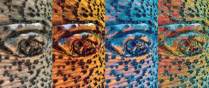
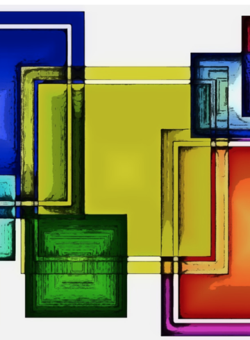
In the first image, the tree bark looks natural, familiar—what we expect. But as
the colours transform in the next three images, the texture, depth, and even the
emotion behind the image changes. A warm golden-orange palette makes it feel
rich and alive, while a cool blue tone adds a sense of mystery. The red and green
combination feels almost electric, giving the ordinary a surreal, dreamlike quality.
This is the power of colour—it doesn’t just change appearances, it changes
perception, mood, and meaning. By playing and experimenting with colour, we’re
not just editing an image—we’re seeing the world in a new way. (I used the Prisma
app to create the different colour effects in the images.)
Key Insights: Colour “rules” are meant to be broken. Traditional guidelines
often limit creativity, but unexpected colour combinations can create stunning,
dynamic, and unforgettable results. Whether pairing navy with black, blue with
green, or experimenting with bold duos like pink and orange, the most striking
palettes come from challenging outdated ideas. Colour is deeply personal, and
embracing what speaks to you—whether soft and subtle or bold and vibrant—
unlocks new creative possibilities. Metallics, neutrals, and unconventional
pairings aren’t just accents; they have the power to transform and inspire. The
best colour choices aren’t dictated by trends or tradition—they come from
exploration, intuition, and a willingness to see colour in a new way.
Related products
-
From the Chapter: “Beyond the Spectrum: Embracing Unconventional Colour Pairings” Navy Blue & Black
Read more -
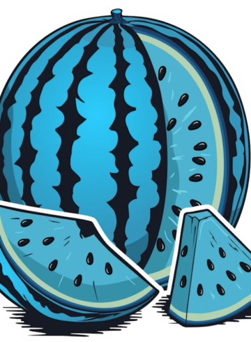
My New Book “Watermelon Blue Re-thinking your Relationship with Colour!” will be released later in 2025!
Read more -
Why I Chose the Name “Watermelon Blue” for my upcoming book!
Read more -
Metallics: Adding a Touch of Brilliance! From the Upcoming book: “Watermelon Blue”
Read more

