Metallics: Adding a Touch of Brilliance
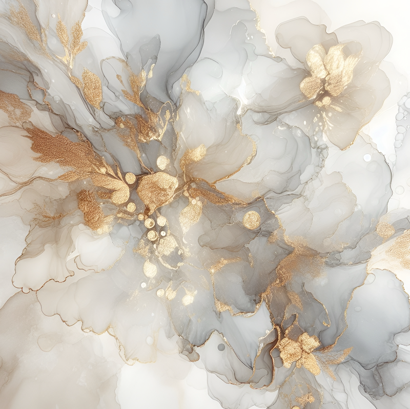
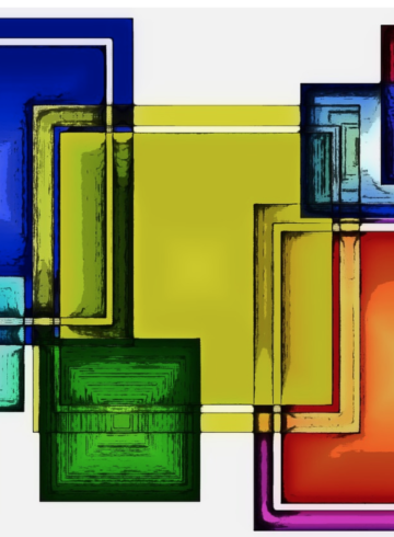
Metallic colours are often overlooked, seen more as accents than a palette of their own. Yet shades like gold, silver, bronze, and copper deserve to take center stage in all areas of creativity. These glowing tones bring luxury, depth, and energy, acting as versatile neutrals that pair effortlessly with both bold and soft colours. Whether adding contrast or a hint of shine, metallics can instantly enhance or uplift any design.
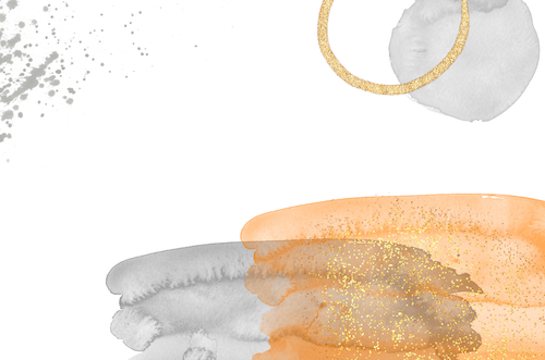
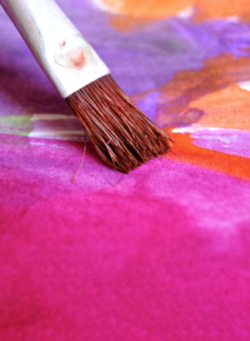
Incorporating metallics doesn’t mean they have to dominate a piece. Sometimes, the smallest touch—a hint of gold leaf, a silver thread, or a bronze finish—can elevate a project. For example, subtle metallic highlights in a painting or design can add dimension, catching the light and bringing the piece to life. In interiors, a copper vase or a brushed-gold fixture can turn a simple
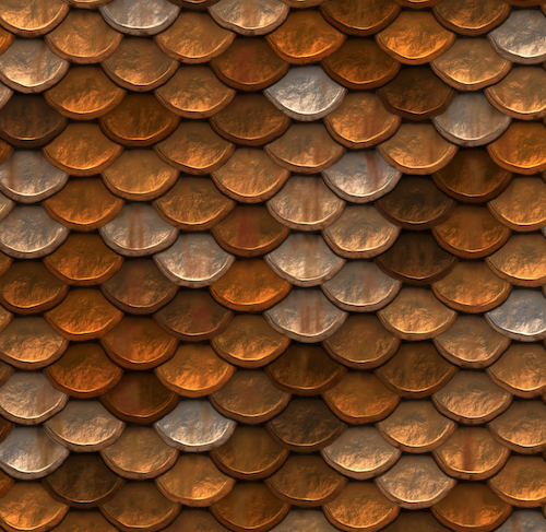
space into something extraordinary. Metallics also shine in unexpected pairings. Silver with warm hues like coral or mustard creates a striking contrast, while gold with navy or emerald green exudes a timeless, regal feel. Even mixing metallics—like the soft glow of rose gold against the bold shine of platinum—can create layers of sophistication and intrigue.
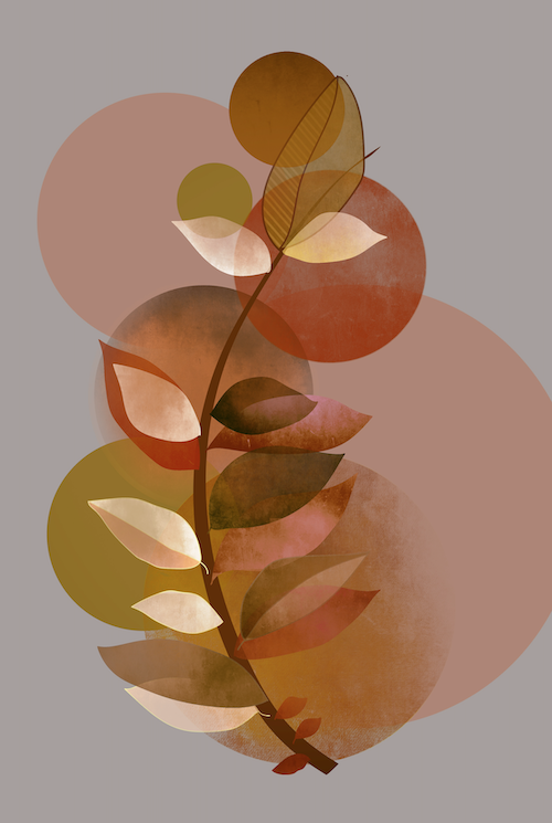
Metallics are incredibly versatile because they can be both subtle and bold. They can bring understated elegance to a design or add even more vibrancy to an already striking palette, proving they’re anything but secondary. Whether used as an accent or as a focal point, metallics show that a touch of shine makes a big impact.
The next time you’re planning a project or design, consider incorporating metallics. Beyond their beauty, they have the unique ability to reflect light, add texture, and create a richness that’s hard to replicate. Metallics aren’t just an accent—they’re a colour choice that invites creativity,elegance, and a touch of shimmer!
All images from: Pixaby https://pixabay.com/
Related products
-
Why I Chose the Name “Watermelon Blue” for my upcoming book!
Read more -

Red & Purple-A Colour Match Made in Heaven! From the Upcoming book: “Watermelon Blue-Re-thinking Your Relationship with Colour!”
Read more -
From Chapter 1 the soon to be released book: “Watermelon Blue-Rethinking Your Relationship with Colour!”
Read more -
My New Book “Watermelon Blue Re-thinking your Relationship with Colour!” will be released later in 2025!
Read more

