Colour!

When I was about 12 years old, my Mom surprised me by saying I could redecorate my bedroom with the colours of my choice, and I was thrilled. I sat down with a box of crayons, and made my own colour swatches, combining a variety of colours I thought looked good together. After several days, I hit upon avocado green and orange. Possibly an odd choice for a pre-teen in 1970, but that’s what I wanted and that’s what I got! Avocado green carpet and “formal” green drapes to match. We painted the walls a medium orange, and bought a hot orange crushed velvet bedspread and throw pillows. All of my bedroom “accessories” were either orange or that unmistakable shade of green. I loved everything about it, and to this day, feel those two colours work well together.
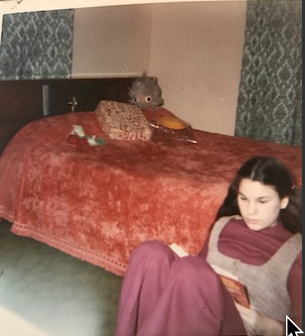
Me, in that very bedroom, book in hand, reading as usual!

If asked, most people have a favourite colour. I honestly can’t tell you mine at the moment, but for many years I would without hesitation say, orange. In recent years I’ve leaned towards neutrals (black, taupe, grey, cream and the like) in my wardrobe. I traveled so much before Covid, I enjoyed being able to reach for just about anything in a suitcase and it would match. In my home and furnishings I favour red, amber, burgundy and a riot of “hot” colours, also in the art that adorns my walls. As far as jewellery goes, it’s a free for all depending on my mood.

As a jewellery designer/creator, colour is at the top of my list. I don’t follow the “on trend” colours of the moment, rather I create jewellery with colour combinations that I love and would wear, or can see my customers wearing, or at times a blend that works well together.

I have a glorious, purpose built studio where I go on a daily basis to dream, design and create my jewellery treasures. The tables groan under the weight of buttons, beads, crystal & stones-All colour coordinated in bins and open boxes, waiting for “their turn” to become Renee Blackwell Jewellery. The studio is a kaleidoscope of colourful delights, and without fail when a visitor comes, one of their first comments is usually: “WOW!!! The colours!”

The process of marrying colours to create the desired look in a finished piece, combines intuition, years of experience and a fair amount of magic. This “magic” is what I and every other designer (whether its clothing, fabric, eye wear, home furnishing or jewellery) strive for. It’s our “secret sauce” so to speak. A great example is the 7 drop crystal earrings pictured below. This style has been a favourite of my customers for years. This combination of 7 crystals is an example of colours complimenting and blending to create a finished look. Imagine, if the top hot pink crystal was removed. The earrings would have a whole different look and feel. It’s this ability to blend seemingly disparate colours, while avoiding a clash, or being to predicable, that satisfies my design eye, and ultimately the wearer.

So, what’s your favourite colour?


Colour!

When I was about 12 years old, my Mom surprised me by saying I could redecorate my bedroom with the colours of my choice, and I was thrilled. I sat down with a box of crayons, and made my own colour swatches, combining a variety of colours I thought looked good together. After several days, I hit upon avocado green and orange. Possibly an odd choice for a pre-teen in 1970, but that’s what I wanted and that’s what I got! Avocado green carpet and “formal” green drapes to match. We painted the walls a medium orange, and bought a hot orange crushed velvet bedspread and throw pillows. All of my bedroom “accessories” were either orange or that unmistakable shade of green. I loved everything about it, and to this day, feel those two colours work well together.

If asked, most people have a favourite colour. I honestly can’t tell you mine at the moment, but for many years I would without hesitation say, orange. In recent years I’ve leaned towards neutrals (black, taupe, grey, cream and the like) in my wardrobe. I traveled so much before Covid, I enjoyed being able to reach for just about anything in a suitcase and it would match. In my home and furnishings I favour red, amber, burgundy and a riot of “hot” colours, also in the art that adorns my walls. As far as jewellery goes, it’s a free for all depending on my mood.

As a jewellery designer/creator, colour is at the top of my list. I don’t follow the “on trend” colours of the moment, rather I create jewellery with colour combinations that I love and would wear, or can see my customers wearing, or at times a blend that works well together.

At one point I felt I might write a book on colour, but when I started to research the topic in depth, I discovered there are volumes of great books already written on the subject. I am absolutely fascinated by the whole subject of colour. What different colours mean or represent. Why we are drawn to certain colours and not others. I was told in third grade purple and red should never be worn together, yet this colour combination is one of my favourites. In fact the incredibly popular “Red Hat Society” has these two colours for their logo & signature look-See image. Link to their page: https://redhatsociety.montonton.com/site

Likewise, convention says navy blue and black should never be worn together, when in reality these two colours were made for each other. Much of what we know about colour is learned & conditioned into us at an early age, paint the sky blue, the sun yellow, etc. And then there’s the company Pantone, the “colour trending/forecasting” leaders of the design world. Did you know they choose a colour of the year, well in advance, which is why when you go into your favourite homewares, department or boutique , you’ll suddenly see everything on offer is a particular shade of green or purple or whatever “they” have chose for YOU to like that season. Want to know more about Pantone, go here: https://pantone.net.au/?gclid=EAIaIQobChMImtyDiuyg9gIVQUwrCh0jrQXXEAAYASAAEgLO0vD_BwE
And in case you’re curious, the Pantone colour of the year for 2022 is called: “Very Peri”, see image below.
Personally, I like to colour outside the lines whenever possible, yet I’m often confronted by past conditioning. As a designer, it’s part of my job to break through these barriers in order to fully develop the possibilities of colour, as it relates to my jewellery creations.

I have a glorious, purpose built studio where I go on a daily basis to dream, design and create my jewellery treasures. The tables groan under the weight of buttons, beads, crystal & stones-All colour coordinated in bins and open boxes, waiting for “their turn” to become Renee Blackwell Jewellery. The studio is a kaleidoscope of colourful delights, and without fail when a visitor comes, one of their first comments is usually: “WOW!!! The colours!”

The process of marrying colours to create the desired look in a finished piece, combines intuition, years of experience and a fair amount of magic. This “magic” is what I and every other designer (whether its clothing, fabric, eye wear, home furnishing or jewellery) strive for. It’s our “secret sauce” so to speak. A great example is the 7 drop crystal earrings pictured below. This style has been a favourite of my customers for years. This combination of 7 crystals is an example of colours complimenting and blending to create a finished look. Imagine, if the top hot pink crystal was removed. The earrings would have a whole different look and feel. It’s this ability to blend seemingly disparate colours, while avoiding a clash, or being “matchy-matchy’ ie, predicable, that satisfies my design eye, and ultimately the wearer.
What’s your favourite colour? In 50 words or less, write a little story telling me what it is and why, and your name will go into a random draw the last day of March 2022 for a one of a kind Swarovski crystal love heart pendant & silver chain. See photo below.
Send entries to: hazelwildretreat@yahoo.com.au